GRR Photography Branding
A reflection of the client’s vision on clear lines and solid shapes.
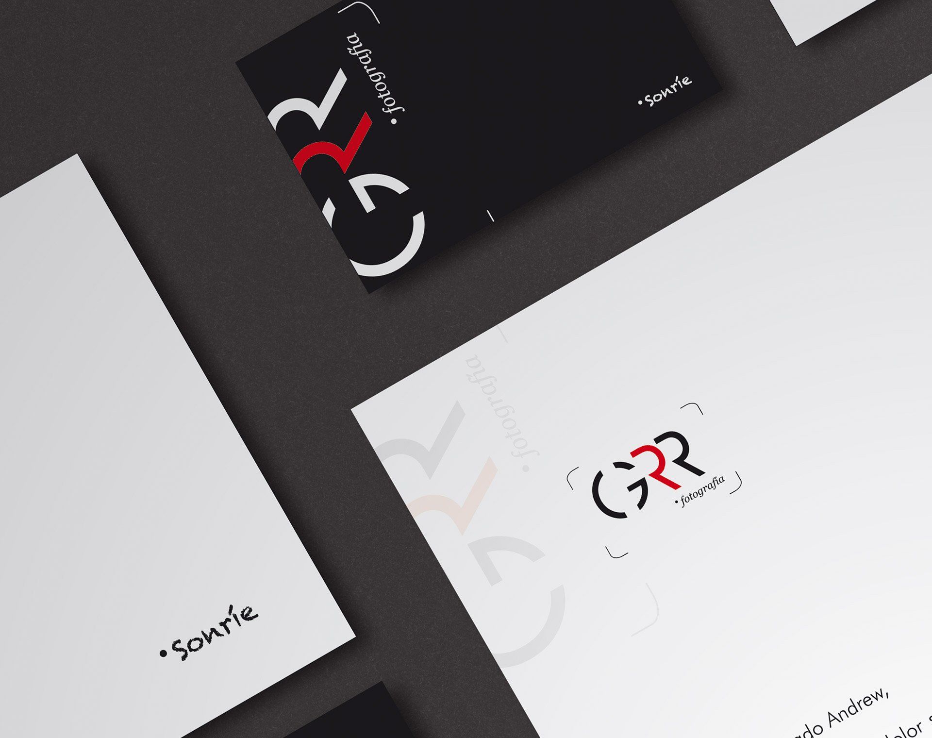
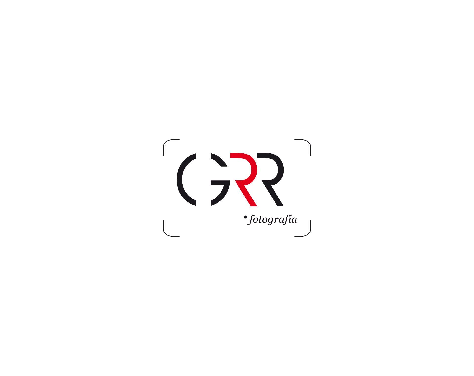
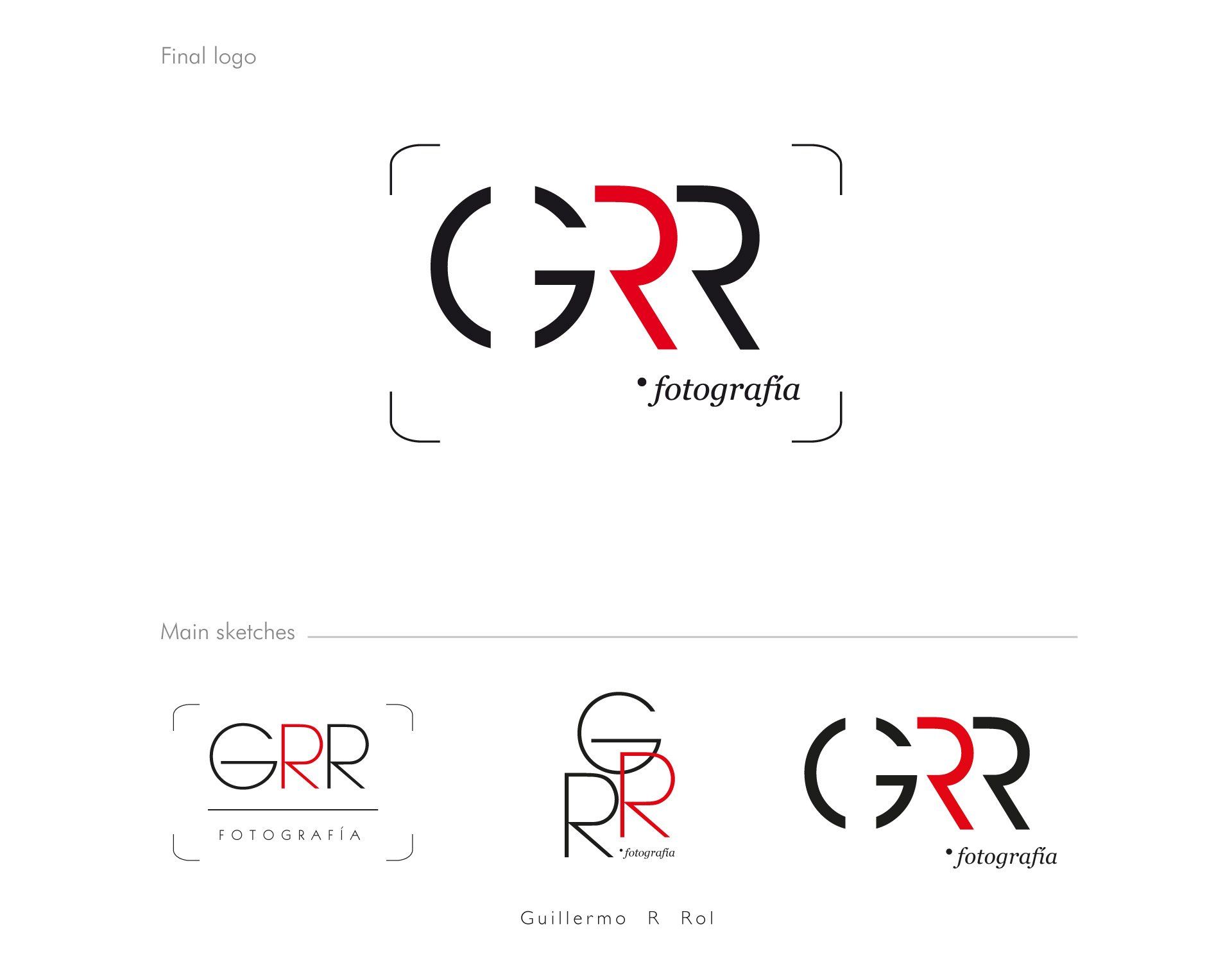
GRR Photography Branding Identity
What we did.
In a first feedback on the sketches I made, the client chose the strongest typeface of the third sketch without any doubt. On the other hand, he wanted to add the shape of the four corners which I designed in the first sketch. The choice of black colour, adding the red one, which reminds the circle of the camera lens, was correct from the start.
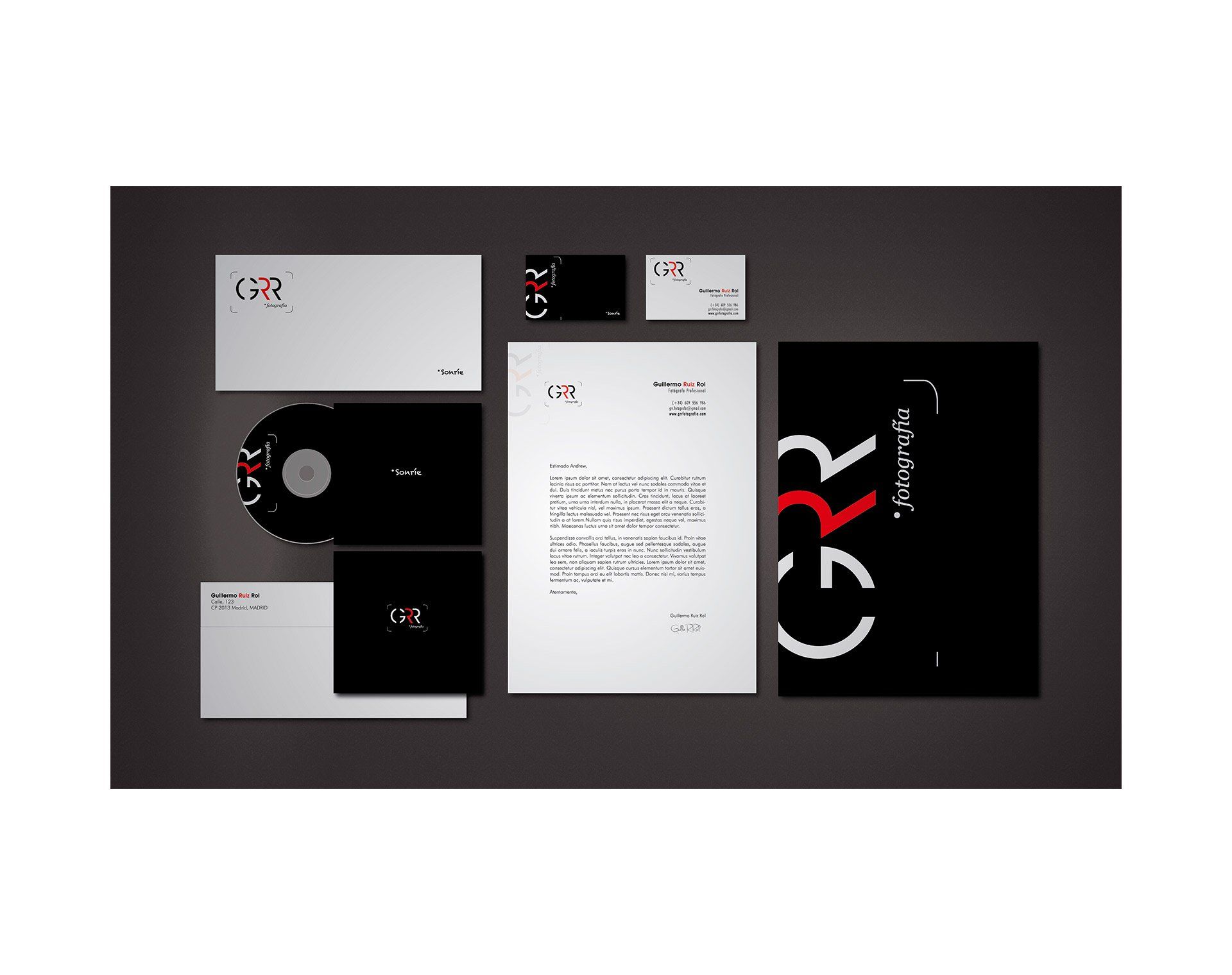
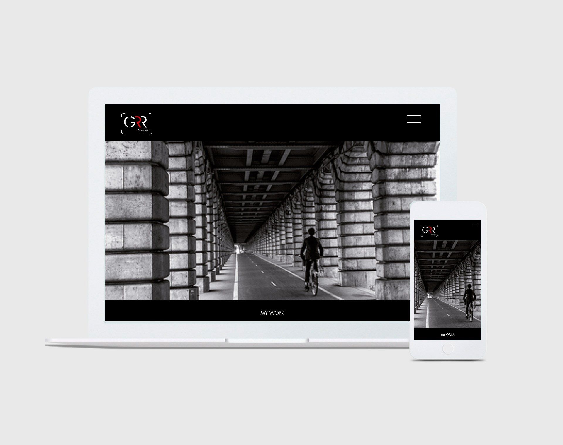
What we achieved.
The aim was creating a new identity which was a reflection of the client's vision on clear lines and solid shapes, as well as his
passion on black and white photographies. I achieved a new identity which is in line with beliefs and personality of my client.
As a result, my client’s identity is engaging with a coherent graphic language to sending the right message, getting the attention of his audience.